In order to decide the format of my website I have looked at a few examples of other photography portfolio websites.
www.worldinmylens.com has been designed by someone who runs a web design agency. It is a very glossy travel photography site and I really like the nice clear galleries split by continent and country. However I don’t like that at the top you scroll horizontally but you are also able to scroll down the page vertically too, it makes it a bit confusing. Also on my mac when I scroll horizontally I keep accidentally opening the preferences panel. Its a bit annoying. It also isn’t very clear how to get back to the home page.
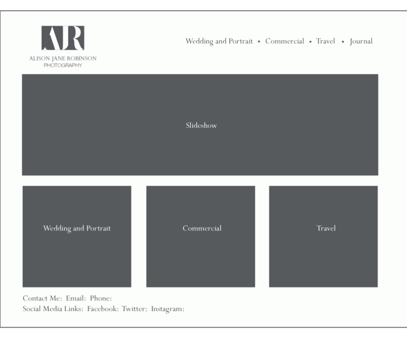
www.stanseatonphotography.co.uk is a lovely wedding photography site. I really like the clear, straightforward, elegant layout with a large display photo and smaller photos used as links to other areas of the site. The menu is simple and it feels like there are not many pages. My only concern is that the Journal section seems to lead to another website – I would prefer everything to be in one place.
Initially I thought I was going to like www.jeremycowart.com but I didn’t really. The thumbnail that I clicked on from another site showed an image with four images below labelled Artist, Humanitarian, App Creator and Teacher. When I actually clicked on the thumbnail, the site had clearly been updated and all the photographs on the home page were displayed in a collage which looked smart but felt a bit muddled. I had liked the idea of galleries that were a labelled according to activities rather than subject area or style of photography.
www.ericryananderson.com has a simple clear website that looks a little more contemporary than Stan Seaton Photography. I quite like the short, snappy, honest bio that he has.
In summary, I would like my website to:
- scroll vertically and not horizontally
- Include clearly labelled and defined galleries
- Have a simple straightforward menu
- Include a larger display photo and smaller photo links
- Everything to be on one website
- The galleries to be labelled according to my activities
- Short, snappy, honest bio
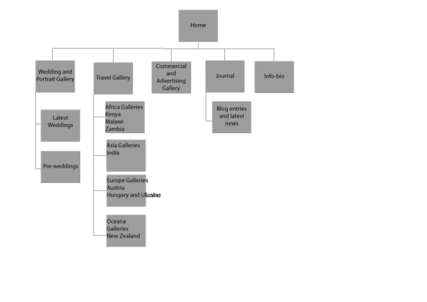
I have several target audiences for my photographs so my website needs to appeal to couples planning to get married as well as commercial businesses, travel companies and stock images businesses. Therefore I think I would like my website to have three or four main menu pages and the following sub-pages and galleries:
I think I would like to borrow heavily from Seaton Photography and for my website to be laid out something like this. I will use the branding that I developed last semester and use the colours I have chosen previously for each of the main areas.